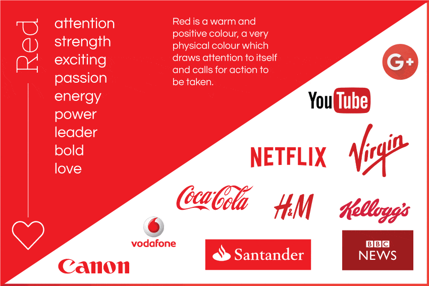
So – many of you that know me well will know that Red is my favourite colour. Why? Well, to begin with, red is a warm and positive colour, a very physical colour which draws attention to itself and calls for action to be taken. Somewhat like myself!
Red is the colour of fire and blood, so it is associated with energy, war, danger, strength, power, determination as well as passion, desire, and love. Red represents masculine energy, whereas its softer version, pink, is associated with feminine energy.
Red is a very emotionally intense colour. It enhances human metabolism, increases respiration rate, and raises blood pressure. It has very high visibility, which is why stop signs, stoplights, and fire equipment are usually painted red. In heraldry, red is used to indicate courage. It is a colour found in many national flags.
Red brings text and images to the foreground. Use it as an accent colour to stimulate people to make quick decisions; it is a perfect colour for ‘Buy Now’ or ‘Click Here’ buttons on websites. In advertising, red is often used to evoke erotic feelings (red lips, red nails). Red is widely used to indicate danger (high voltage signs, traffic lights). This colour is also commonly associated with energy, so you can use it when promoting energy drinks, games, cars, items related to sports and high physical activity.
Physiologically, it stimulates and energizes the physical body, including the nerves and the circulation of blood, raising blood pressure and heart rate. It is stimulating to the appetite and therefore a great colour to use for any product associated with food and its service, including restaurants and take-away businesses.
It excites and motivates but in excess it can cause anxiety and tiredness. It also has negative connotations associated with blood, war and violence.
The colour which most compliments and balances red is turquoise, although green or blue will also create balance. Although my personal favourite is the striking, graphic effect of black and white with a slash of red.
Bright red represents joy, sexuality, passion, sensitivity, and love.
Pink signifies romance, love, and friendship. It denotes feminine qualities and passiveness.
Dark red is associated with vigour, willpower, anger, leadership, courage, longing and wrath.
Positive Colour Meanings:
• action, power, energy, speed
• passion, desire, lust
• strength, courage
• attention-grabbing
• motivating, stimulating and energising
• driven and determined
• exciting, warm, spontaneous, assertive and confident
Negative Colour Meanings:
• aggression and anger
• domineering, over-bearing and tiring
• quick-tempered, ruthless, fearful and intolerant
• rebellious and obstinate
• resentful, violent and brutal