Magenta is a purplish, pinkish colour that works well in both RBG (digital) and CMYK (print).
It’s been a while since I wrote about colour, so I thought I’d write about some of the less popular choices, but by no means less vibrant! This month I thought I’d focus on one of the more feminine colours – Magenta. In order to know if Magenta is a good colour to for your brand, you need to understand the traits, qualities and mood of the colour along with the psychological meaning. You are more likely to attract your target market by using the right colour for your brand.
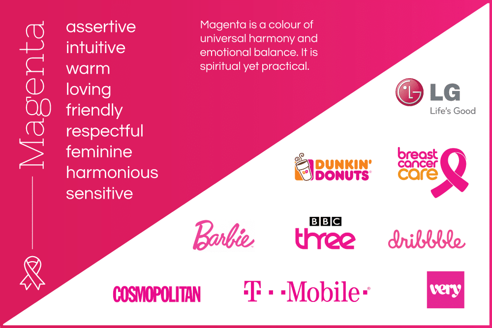
Magenta is a colour of universal harmony and emotional balance. It is spiritual yet practical, encouraging common sense and a balanced outlook on life. It promotes compassion, support and kindness and encourages a sense of self-respect and contentment in those who use it. Physiologically magenta helps us to flow with life and let go of old ideas. It’s associated with love, warmth and respect and is a very feminine colour.
Personality traits for Magenta
Magenta is unconventional that prides itself on being unique, it’s also a friendly and welcoming colour. It is also agreeable, very helpful and doesn’t like confrontation. Emotions are often expressed and open for all to see. Magenta is a colour that has strong connections to spirituality and intuitive thinking. On the negative side of this intuition is that an intuitive personality is not usually very practical. An intuitive person thinks with the heart or gut, which can work, but can also been seen as unbusinesslike. This is why Magenta is not often used by corporate companies.
Magenta is a strong and inspiring colour which can appear outrageous and shocking on one hand or innovative and imaginative on the other. It is particularly attractive to the non-conformists in the community. Magenta
So, is Magenta a good colour for your brand?
If you want to attract a more female audience, which is community based, then Magenta is the ideal colour for your brand. If you look at the popular Magenta brands on a global scale, they are all aimed at a similar target market. Cosmopolitan, Barbie, Very, Breast Cancer Awareness. However, there are a few exceptions to the rule, such as tech firms T-Mobile and LG. Sometimes, when a market is saturated with competitors, using a dramatic colour which is not associated with the industry, can really make an impact.
Colours to combine with Magenta
Magenta can be combined with navy to create a balanced, authoritative yet caring effect. Navy is a classic colour which denotes trust and order so helps add a business-like charm to the intuitive magenta. One of my personal favourites is the colour clash of red and magenta – this really shouts hello in a pioneering, assertive nature. Magenta works well with all warm colours, so can also be combined with orange as per the famous dunkin’ donuts logo. Purple also works well with magenta due to the similarity in colour. The purple and magenta combination is particularly feminine. Be warned though, that purple is one of the most disliked colours by both genders! Learn more in my Colour by Gender blog.
Positive Colour Meanings:
- universal harmony and love
- spiritual yet practical
- encourages common sense
- loving, compassionate, supportive and kind
- imaginative, innovative, creative and artistic
- non-conformist
Negative Colour Meanings:
- avoids challenges
- too relaxing
- can be overbearing and demanding
Take a look at some of my Magenta clients: