Why should you use infographics
to deliver your key messages?
What is an infographic?
Infographics are images that relay information in a visual format. Usually while using an illustrative style with cartoon-like characters combined with charts and diagrams. This distinct visual formula makes them extremely effective at delivering content, as they get your key messages across in a simple, succinct manner.
Why do infographics work?
We live in an ever-increasing visual world, where images gain far more attention than text. Apparently, the average human attention span is now about 8 seconds – that’s worryingly less than a goldfish’s! It’s also commonly known that 90% of all information transmitted to the brain is visual. And the average brain processes imagery 60,000 times faster than text.
Furthermore, it’s also understood that 40% of consumers will respond better to visual information than plain text. Hence, this makes a compelling argument to use of more infographics in marketing campaigns to increase engagement.
How do infographics increase engagement?
With the dramatic increase in social media usage over the past five years – especially for image-based channels such as Instagram and Pinterest – sharing visual content has become a simple and common past-time. One could argue that infographics have developed as a result of this visual social sharing phenomenon.
Infographics are easily digested, due to their fun and informative nature. Hence, making them perfect for capturing attention online and getting your business seen by a wider audience. If people like your infographic, they’ll share it – providing a useful link back to your website. Organic free advertising.
Infographics are also great for gaining greater brand awareness due to their instant visual appeal. If you have established brand guidelines for your business, then you have a set visual identity with colour palette, typography, image styling and graphics. These can be used when creating your infographics. The more your infographics are shared and seen, the greater awareness your brand receives.
What’s the best subject matter for an infographic?
The subject matter for an effective infographic can vary. Processes and systems always work well in a visual format as the mundane can be easily digested in a clear graphic format. Facts, figures and statistics can be easily livened up with unique illustrations and icons. Even charts and graphs can take on a beautiful linear quality when designed using slick graphic styling. A well-designed infographic can easily turn the most mundane data into eye-catching visuals that will make your audience want to read or view more.
Every good brand should have a story. Infographics can help you tell your story visually and encourage your audience to feel connected to your message. Emotive content is always a great pull for a consumer engagement. So make sure your message is affective and tell your story through imagery and diagrams.
Infographics are not just for online use.
Infographics are not solely for online use. They can also be used in printed reports, brochures and magazines, turning text-heavy pages into more interesting reads. Powerpoint presentations are also increasingly being redesigned using more visual graphics and icons to quickly get across the key messages. Using images and graphics in a slidedeck has proven to be more effective. It holds people’s attention longer than just listening to a speaker.
Especially relevant tips for designing the perfect infographic.
1. Keep it simple, less is always more.
2. Size between 600-1000 pixels wide and maximum of 4500 pixels high.
3. Structure content to be legible in 600-800 pixels high sections.
4. Don’t overload your audience. If you have a lot to say, create a series of infographics.
5. Use white or empty space to help draw the viewers’ eye through the graphic.
6. Add your logo in a prime position – usually top or bottom.
7. Don’t forget your call to action – usually at the bottom.
8. Be consistent to your brand guidelines with imagery, graphics and icons.
9. Use your brand colours or choose a simple, complimentary colour palette.
10. Use a maximum of three fonts and not more than five different font sizes.
If you need further assistance creating the perfect infographic, please do reach out and see how I can help you. Alternatively, if you feel your brand is lacking brand guidelines with suitable colours, fonts and image styling to provide optimum visual impact, get in touch and I can provide the ideal visual identity to attract your target market.
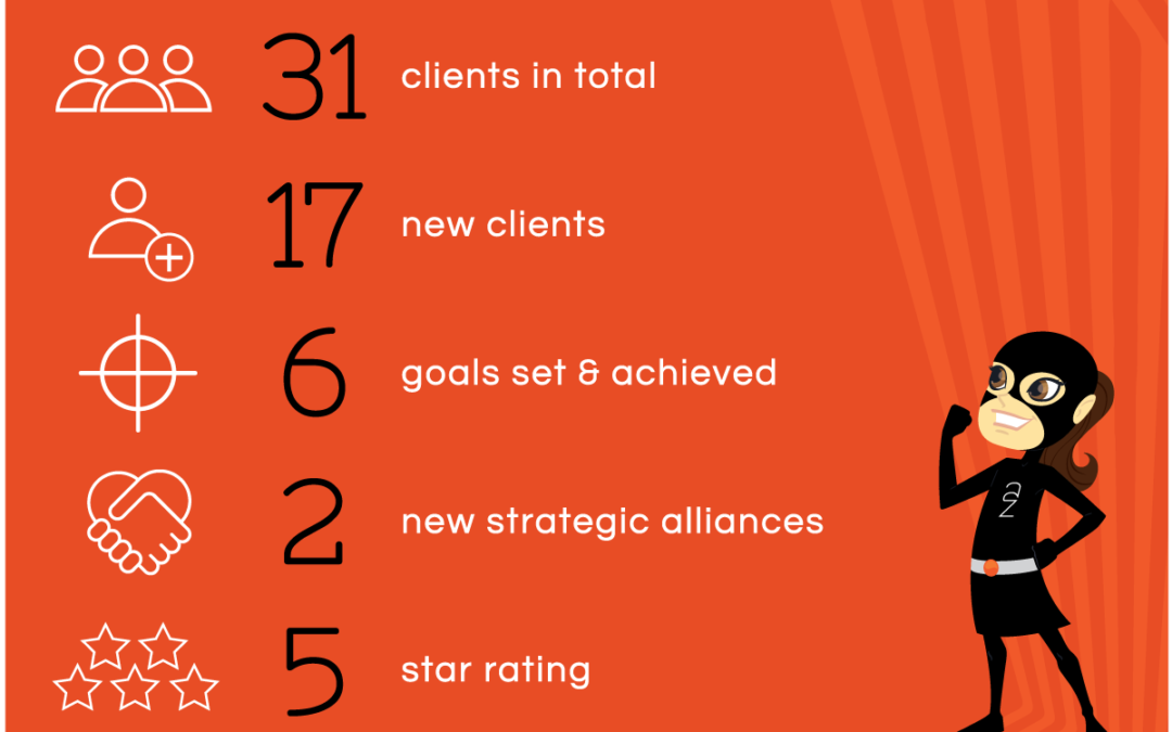
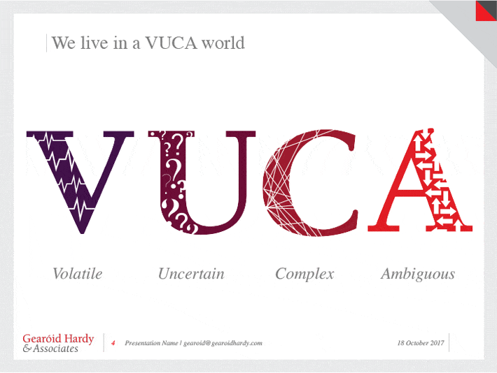
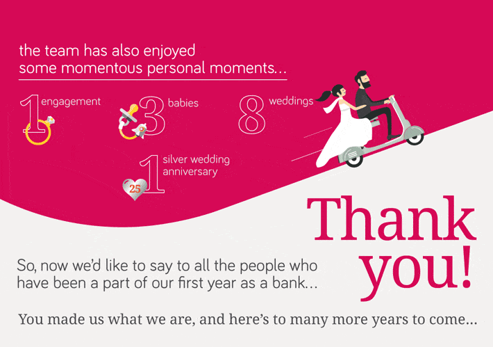
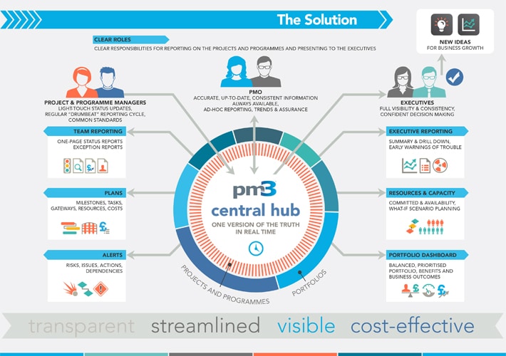
Finally, Infographics I have produced for clients recently:

In addition, for design inspiration, some great examples of infographics can be found on pinterest, by searching the word infographics.