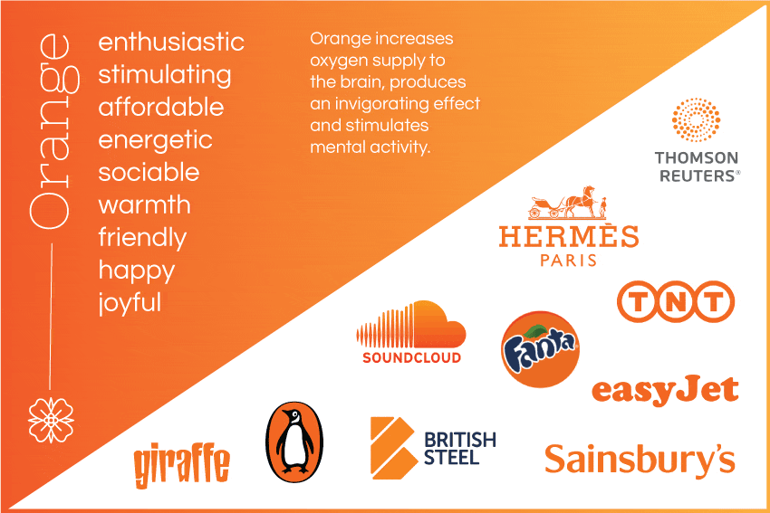
So, as Autumn approaches I have chosen Orange as the next brand colour to discuss. To begin with, it is a warm, vibrant and flamboyant colour. It is energy combined with fun, the colour of the risk-taker, the extrovert and the uninhibited. Orange is the colour of Autumn and harvest. In heraldry, orange is symbolic of strength and endurance.
In colour psychology it means adventure, optimism, self-confidence and sociability. Orange increases oxygen supply to the brain, produces an invigorating effect, and stimulates mental activity. Physiologically, orange vitalises, inspires and creates enthusiasm. It is also stimulating to the appetite and social conversation and therefore works well in restaurants, food products and toys. Orange has very high visibility, so you can use it to catch attention and highlight the most important elements of your design.
Psychologically, in business applications orange gives the impression of affordability, depending on the shade chosen and its combination with other colours. Too much of it can suggest cheapness. Use your own judgment based on how it affects you – if it looks cheap to you, it will do the same for others.
Dark orange can mean deceit and distrust.
Red-orange corresponds to desire, pleasure, domination, aggression, and thirst for action.
Gold evokes the feeling of prestige. The meaning of gold is illumination, wisdom, and wealth. Gold symbolises high quality.
Positive Colour Meanings:
- adventurous, risk-taking, vibrant, flamboyant
- stimulating to the senses
- affordable
- warm, sociable, optimistic, enthusiastic, cheerful
- self-confident, independent, extroverted and uninhibited
- creative flair
- warm-hearted, agreeable and informal
Negative Colour Meanings:
- superficial and insincere
- dependent, over-bearing, self-indulgent
- the exhibitionist, pessimistic
- cheap, unsociable


