
When it comes to branding, what you are doing is giving your company a unique visual identity. A brand visual identity is important. It’s what makes you stand out from the crowd and attracts new customers. A brand visual representation of your business also reassures existing customers that they are at the correct place. This is because your visual representation should inform the audience about your services or products. It clearly needs to represent your business’s products or services. It should also enlist an emotional response from your audience as your brand becomes familiar, trustworthy, and memorable through consistent visuals.
As they say, first impressions count. As a business’s first interaction with a customer, the visual branding should create a positive and confident impression. So, what’s included in a brand visual identity? This blog will delve into what should be in yours.
What’s included in a brand visual identity?
A suite of assets
Your brand suite of assets is a collection of visual elements. These characterise how the public recognise your brand. This includes your logo design, your website, your social media images, and your business cards.
Your brand assets form the base from which your brand develops. Having a strong and positive base from which your suite of assets forms, will ensure that people can easily identify your strong brand. A suite of assets will ultimately define your brand and cause it to be consistent and memorable.
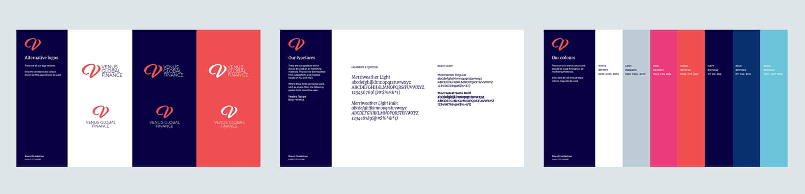
A business logo
![]()
Having a logo is central to constructing a visual graphic identity. A logo is the brand’s visual representation, and it needs to be memorable to the target audience. It also needs to clearly inform people of what products or services the business has to offer.
Devoting time and money into creating a logo design is important. A logo will ensure you have a professional, confident, and visually pleasing presence. This can then be used across all platforms used to advertise your business.
Identifying which branded materials you will be using to advertise your business, will assist in how to design the logo. For example, will your logo feature on business cards, flyers, billboards, or social media profiles? Think of anything you will use where the aim is essential to identify the brand. The logo is one of the visual identity elements that can evolve when the brand evolves.
Branding guidelines
Branding guidelines define and detail the overall design and content of all marketing materials. In simple terms, it’s like an instruction manual on how to display the brand. This will ensure that the brand stays consistent regardless of which advertising materials are being used. For example, the brand consistently uses the same logo across the website, social media profiles, leaflets, and business cards. Plus, all marketing material will feature the same brand colours, language, logo and font.
Brand guidelines will cover all the aspects of a brand’s identity such as logos, colours, typography, images, and language. Identity is important and so is remaining consistent. This is the ultimate way you become memorable, and more importantly, recognisable.
Iconography

Iconography is a quick yet effective way of ensuring people can read your marketing quicker. It allows your audience to easily recognise something and gives a universal definition. Icons need to be simple so they can be easily recognised and understood by a customer.
We live in a very visual world, and we have a limited time to get our audience’s attention. That’s why visuals are so important. Adding icons and illustrations to your marketing and website captures your audience’s attention whilst allowing you to convey the same message some copy would. For example, instead of “Email us today”, you could have the icon of an envelope. When clicked, heads to the contact page. Icons guide people in a specific direction and make information easily readable and more appealing.
Iconography also allows you to divide up long text, and separate sections. Pick out information that you usually repeat, or ones that can easily be transferred into an icon. These should visually represent your brand and be consistent with your other brand visuals.
Colours for your brand visual identity
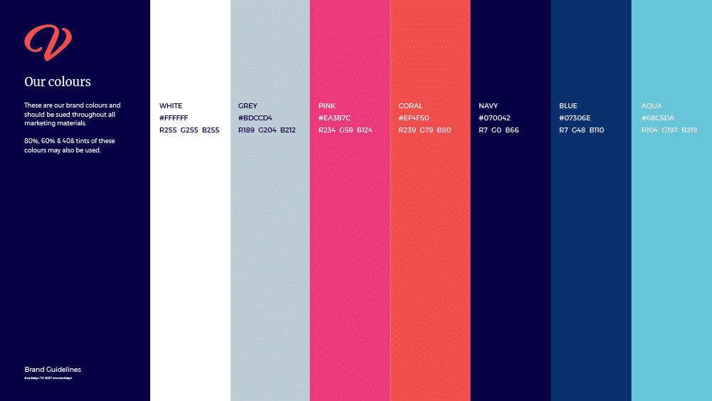
You need to discover your brand colours. The way we see colour, evokes certain emotional responses in us. For example, the colour red can signify love and warmth, while yellow can signify sunshine and happiness. When used correctly, colours can influence how someone feels and behaves.
Ultimately, colour can help to sell a product or service. Repetition of the same primary colour can strengthen brand awareness. All you have to do is look at major retailers such as Coca Cola and McDonald’s to realise that repeating your brand colours will add to your branding.
Using a colour palette with different colour schemes can give you an idea of how best to portray the story you wish to tell. Bold colours aren’t always the best if, for example, you are trying to sell a relaxation service. This may work best with pastel colours.
Typography
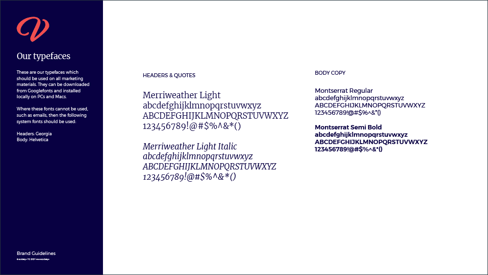
Typography is arranging letters and text to make the copy clear and visually appealing to the reader. This arrangement involves selecting font style, line spacing, structure and appearance. A logo and icon create a strong visual identity, but the type is equally as important. The type is for headings, subheadings, and the main body of text.
Often you choose different ones for the different sections of text. For example, you could have a font harder to read for the title. However, all main text needs to be in an easy to recognise the font.
Imagery for your brand visual identity

Graphic design images are visual elements, which tell businesses apart from each other. They help to make you truly unique. Imagery includes photos, graphics, and illustrations, which are created specifically for the brand. A simple example of imagery is the pictures used in the clothing catalogue or the photo used on the home page of your website.
A graphic device
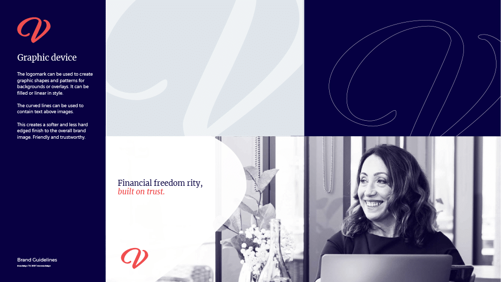
A graphic device helps to strengthen a business’s identity and enhance images and communication. Patterns overlay images and help direct a customer’s gaze to a specific section. Often, elements from the logo get extracted and used as a graphic device. For example, if you have flowers in your logos, these would be extracted and used elsewhere in your marketing and branded materials.
Photography
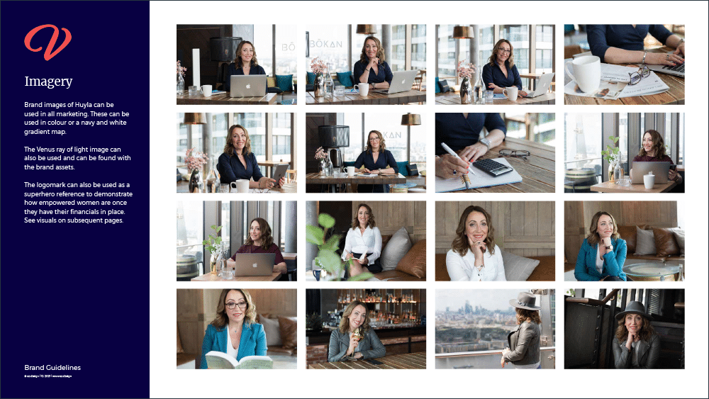
Brand photography contains a set of professional images that represent your business. They fit your brand strategy and how you are portrayed. The professional images will include appropriate colours, props, sets and anything else that closely links to your business branding. These images may include your products, your team, your services, and other aspects that make up your business.
A range of photographs that remain consistent in terms of colours, backgrounds and props keep your business looking professional. Thus, adding to the strong visual branding.
A strong brand visual identity doesn’t rely on a logo
When you combine everything included in a brand’s visual identity, a logo isn’t needed to identify a brand. It can be identified by everything else. A brand visual identity package will allow your brand to become memorable, and consistent and create the right impact with your target audience. It also helps to create an easier marketing strategy for your business, as you know exactly what visuals, fonts and colours to use. In fact, a strong brand visual package ensures you have everything you need to represent your business going forwards.
If you’d like to discuss your brand visual identity, contact us today.
The examples in this blog post show a recent brand+web project by az.design. See the Venus Global Finance website for the full brand visual identity effect.