BEST WEBSITE COLOURS
This week, I was approached by American design firm, My Biz Niche, asking if their infographic was suitable for my blog. I was immediately impressed with the infographic. It details some great statistics and information on the best website colours to choose when designing your website. If you are a regular to my blog, you will see that I have written blogs on the the psychology of colour for brands. This infographic seems to flow on nicely from these, with more focus on website design and how colour can affect conversion rates.
I often recommend that solopreneur start ups set up their own website in the first instance, to cut back on costs from the outset. Once the business is established and your offer, services and target market are clearly defined – then it’s time to get a professional involved to take your brand and website to the next level. This post will prove useful to those of you using Squarespace or Wix to design your own site.
I have broken the infographic up into sections, so that it’s easier to digest. The complete infographic can be found on my pinterest account.
So, what are the best website colours for high conversion rates?
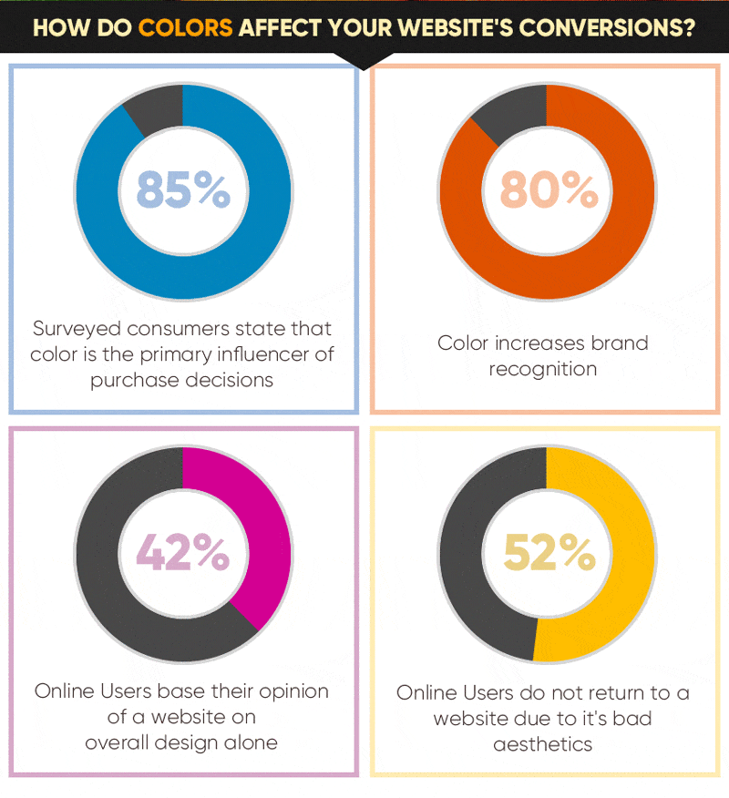
The power of colour cannot be underestimated. People have a natural, instinctual reaction to colour. Therefore, they should not be randomly used when designing a website. Most good website designers are empowered with the knowledge of the emotional impact colour has on people. Blue is always a favourite, so it’s unsurprising that it comes top in as the best website colour for conversion rates.
How do colours stimulate the brain?
Many studies have shown how colours stimulate different areas of the brain by promoting excitement or tranquility. With this in mind, your website can influence your online users and the conversion rate by grabbing their attention and triggering certain emotions.
Understanding colour coordination
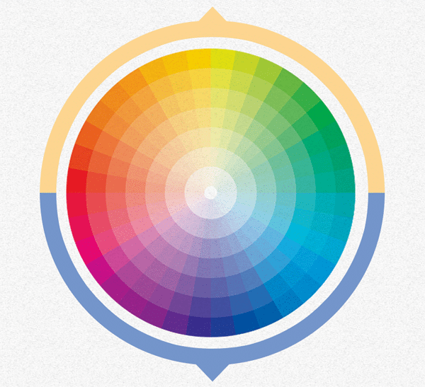
The colour wheel
The colour wheel is an abstract illustrative organisation of colour hues around a circle. It is a chart representing the relationships between colours. Good web designers should use it to combine colours that go well together.
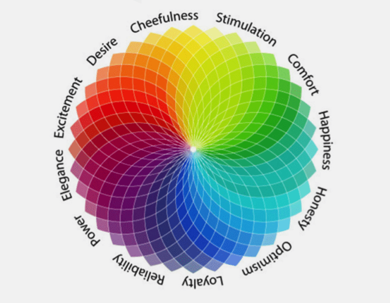
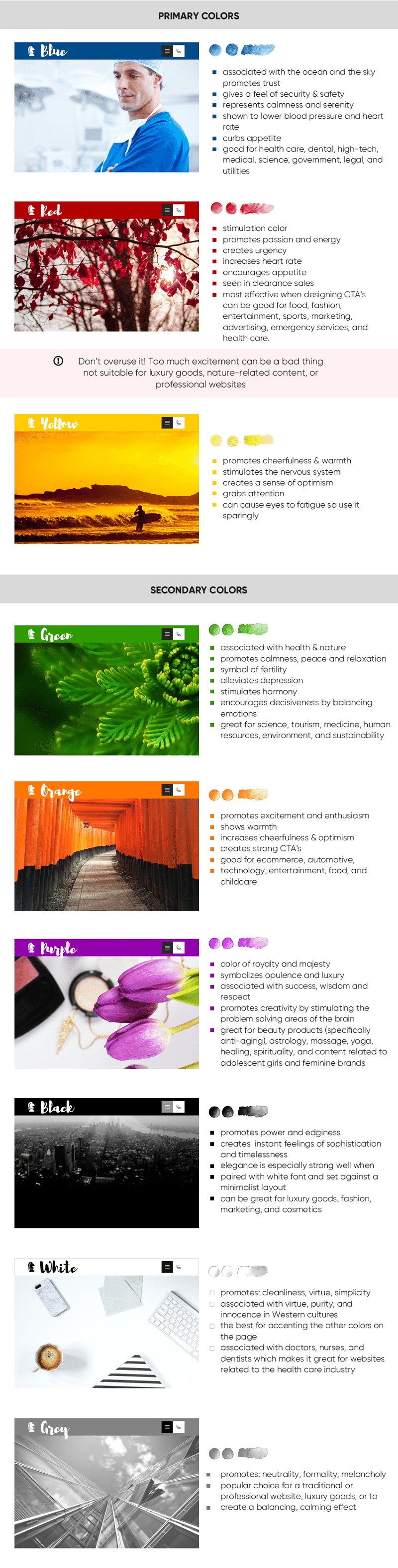
The main website colours
So, as per my individual blogs on colour, My Biz Niche have done a great job of showing all the main colours and their meaning in their infographic. Take a look at this as a quick guide, what’s your area of business and which colour is therefore best suited? There are primary colours and secondary colours. Primary is the main one or two colours. Secondary colours complement the primary and add subtlety or vibrancy to your site. I always like to have a neutral – black or grey as well in my colour schemes.
Developing the best colour scheme for your website
So that’s the lowdown on colours. But what else do you need to know to chose a striking or effective colour palette for your website and brand?
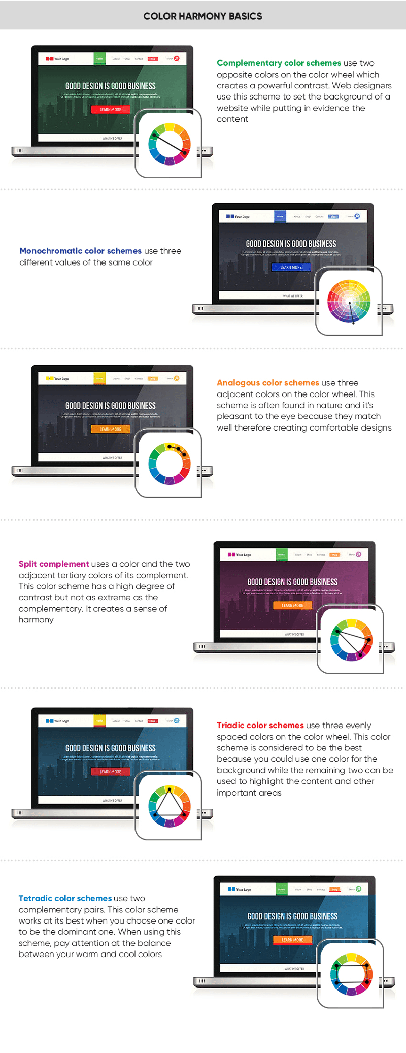
Colour harmony basics
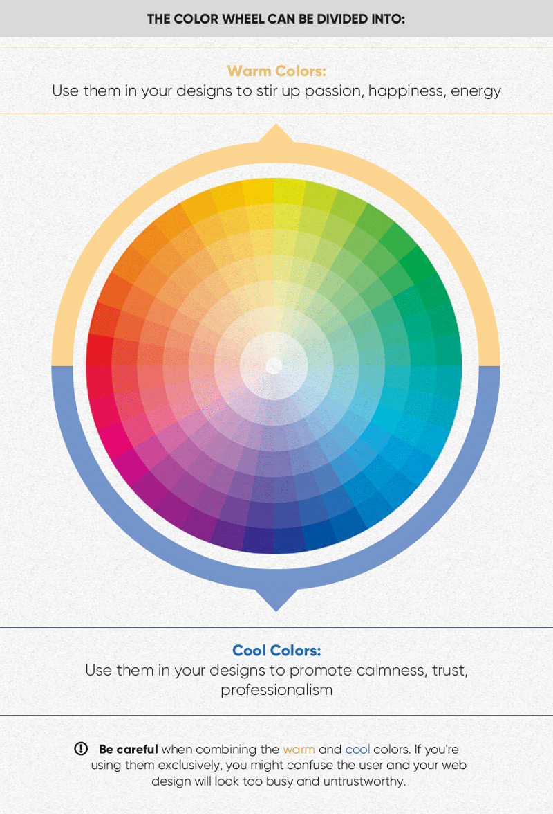
Colour harmony looks at the overall effect that colours have when used together. Are your colour harmonies going to be subtle and calm? Or vibrant and striking? This is all about your colour selection. These are the different types of colour harmonies, which can be seen in the infographic below:
Complementary colours
Complementary colours use two opposite hues from the colour wheel. This creates a powerful and dramatic contrast. It works very well when creating duotone images.
Monochromatic colours
This is when three different shades or values are used of the same colour – for example – all blues, or all black and greys.
Analogous colours
These use the adjacent colours in the colour wheel and is easy on the eye as all the colours blend harmoniously together.
Split complement colours
Uses a colour and the two adjacent tertiary colours of it’s complement. It has a high degree of contrast but hot as much as complementary.
Triadic colours
Use three evenly spaced out colours on the colour wheel. This is considered one of the best options for website design.
Tetradic colours
Uses two complementary pairs. This works best when you choose one colour as the dominant one and then the others for CTAs. Or use the different colours for the different sections/services on your website.
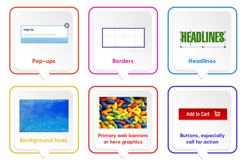
Where should you use colour on your website?
There is no obvious guide as to where to use colour on your website. It’s really dictated by the content on your site. But, here are some key areas that colour could be used to make a difference.
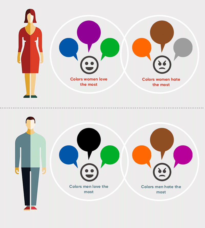
Which colours do men and women prefer?
I have also written a blog post which details the differences between the sexes and colour preference. Read Colour by Gender here. Blue comes out strong again for both men and women. Brown and orange should be avoided at all costs!!
Choosing the right colours
Choosing the right website colours requires a lot of creativity and experimentation. Bear in mind that colour is very psychological and that different colour harmonies produce different effects. For example, analogous colours are similar in hue, creating a smooth transition from one colour to the next. Complementary colours are opposite to each other, so they create a strong contrast. Monochromatic colour schemes can be subtle an sophisticated and cam allow imagery or products to shine.
Once you’ve selected your colours, you may wish to adjust the value of a specific colour – how light or dark it appears. Or you may wish to adjust the saturation, how rich and bright it is. Each hue on the online colour wheel has a different inherent value. Yellow, for example, is lighter than blue. To increase contrast between the colours in your scheme, you may need to adjust the value of one of the colours – making the yellow lighter for example so it sits well against the blue.
Try to avoid having coloured text on a coloured background, it’s best to use white or black text on coloured background to avoid colour discord. For example, this can happen when you add green text on to a red background.
To conclude, here are some useful resources:
https://www.sessions.edu/color-calculator/
https://thenextweb.com/dd/2015/04/07/how-to-create-the-right-emotions-with-color-in-web-design/
https://www.jenreviews.com/color-meaning/
So, to view the full best website colours infographic click here.
Finally, many thanks to My Biz Niche for allowing me to use their infographic on my blog. I hope you found this article useful. If you’re a US-based business looking for a website design agency, you should definitely give them a shout.