THE AZ.DESIGN FUNDAMENTALS. part 2
Now with online tools such as Canva, PicMonkey and Piktochart, it’s very simple to create your own stunning graphics for your digital marketing. Without doing myself out of work, I would like to share with you some key design tips to help you produce striking, visually-balanced graphics. So here are the final graphic design tips to give your brand a really slick finish…
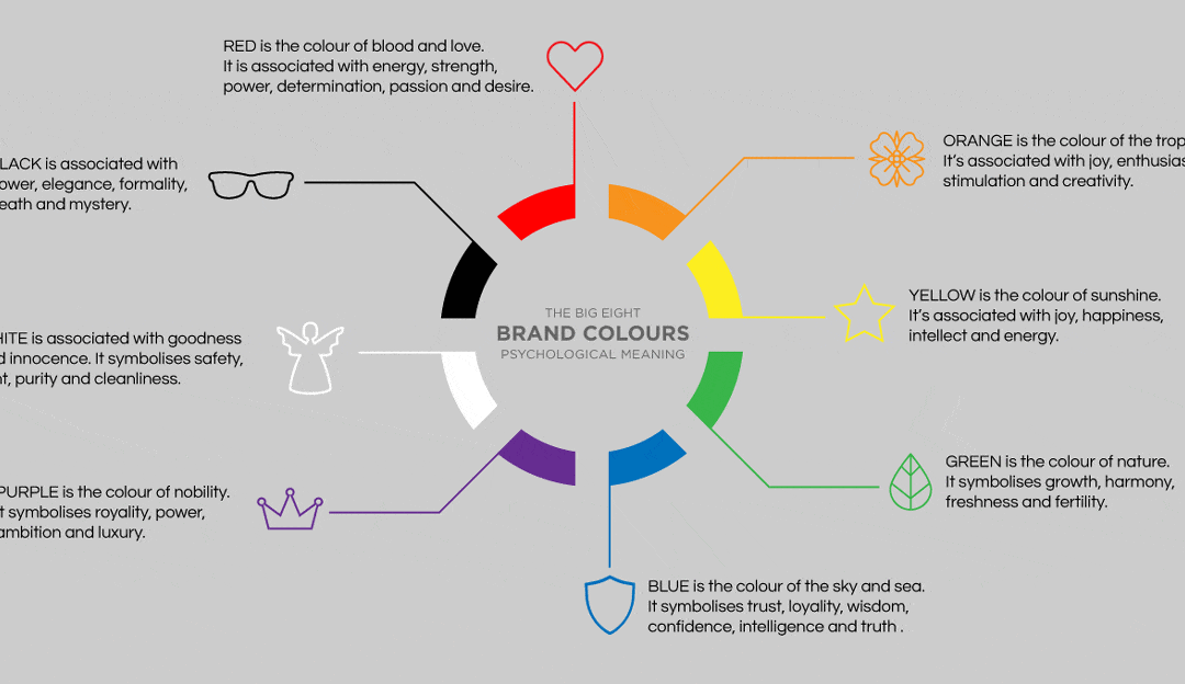
06. Colour messaging
Colour is a powerful tool for designers. So, it makes sense that a carefully arranged, consistent palette is key for brand consistency and recognition. Most brands have a primary colour palette which is usually used for the logo. Then there is a secondary palette which compliments the primary. This is used throughout all marketing materials for the brand.
When compiling a colour palette, it’s very important to consider colour theory and meaning. Colour theory dictates that certain hues can create specific reactions in consumers. For example, orange is thought to stimulate an appetite, which is why orange is a commonly used in fast food designs. Green is associated with nature and is often used in natural food products or health products. Understand more about individual colour meaning in my brand blog.
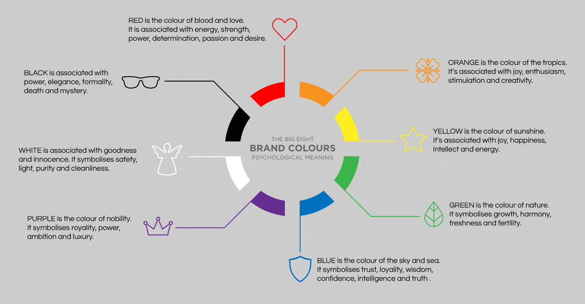
07. Flattering fonts
To keep your brand on-point and consistent, you should create a fixed typographic palette. Different fonts portray different messages and help establish your brand personality. For example, a sans serif font is modern and clean, whereas a serif font has a more established, traditional feel.
Use a maximum of three different font styles to avoid overcomplicating your designs. Choose fonts that complement each other and your brand personality to create a logical and effective effect.
Make sure you choose an easy to read font for your main body font – whereas your header/display fonts can be bolder and more playful.
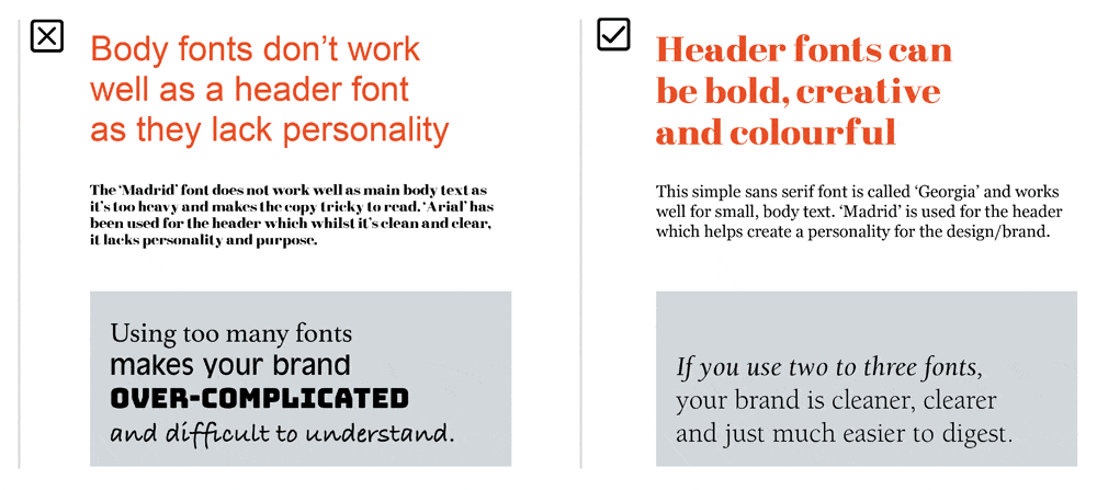
08. Legible line lengths
Have you ever wondered why newspaper articles are printed in columns? This is because, the longer the line length, the harder it is for the reader to follow the line to the very end. Equally short line lengths are also hard for the reader to follow.
The golden number for body copy line lengths is a minimum of six words per line and an average of about 30-40 characters (including spaces) on each line.
Break large text blocks into columns – this applies particularly to powerpoint presentations when the format is horizontal and line lengths are often far too long.
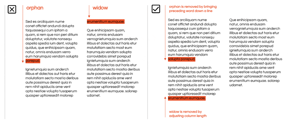
09. Widows and orphans need company
An easy way to take your design from amateurish to polished and professional is to recognise and eliminate typographical widows and orphans. What the h*** are these, I hear you ask?
A widow is a term for a line of text that belongs to a paragraph and has moved over to the next column. An orphan is similar, but a single word on its own on a line at the end.
You can manually place a soft return (press shift + return) on the word in front of your orphan, to bring it down a line to fix this common problem. Another way is to adjust your textbox or column sizes to allow the whole text block to move around and get rid of the orphan or widow.
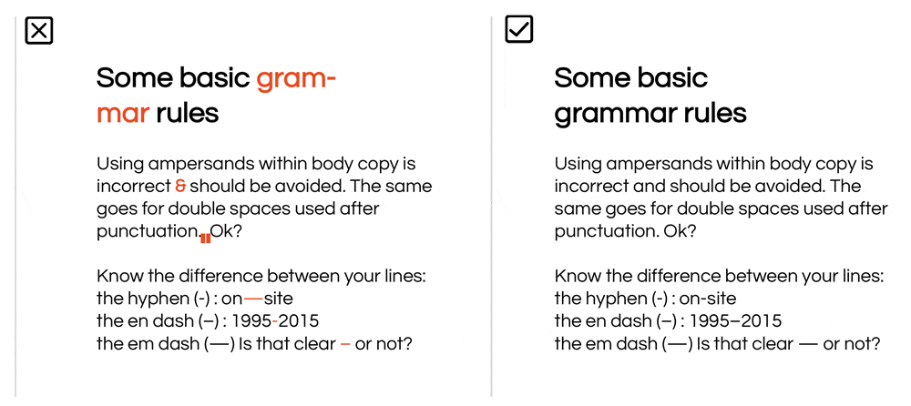
10. Key grammar & punctuation points
There are lots of different punctuation and grammar rules which differ from country to country. There are a couple that apply purely from a design perspective, which go against what we have often been taught.
Ampersands should never be used in body copy. There are most commonly used for organisation titles or names like Johnson & Johnson, or stylistically within logo/identity design.
Another common error is double spaces after a full stop. One space is more than enough. Two just ends up looking too gappy and rendering legibility difficult.
One more point is hyphens and dashes. Basically there are three types of hyphens/lines: the hyphen (-), the en dash (–) and the em dash (—). The hyphen is used to join two words (e.g. “custom-built”). An en dash is used to connect numerical values (e.g. “1995–2005”). An em dash is the length of an ‘M’ and is occasionally used within sentences to stand in for a comma (e.g. “Grammar is hard — or so I once thought”)
Well, that’s the second half of my top 10 graphic design tips for you to take in and focus on when you’re next designing your own marketing materials. Take a look at graphic design tips part one here.
If there’s one thing you should remember from this post, it’s have HAVE FUN WITH YOUR FONTS in your designs. Google fonts now offers a wide choice of exciting fonts that can be downloaded and installed on your computers for free. This means you can use your chosen fonts across everything, including your website as Google fonts can also be used online. 
Here are some examples in my portfolio that demonstrate the above graphic design tips:
GRAPHIC DESIGN TIPS by Angela Zeballos