What’s responsive logo design?
Responsive logo design is the buzz trend in corporate identity for 2018/2019. Logos must now work across a variety of media and marketing channels. Both online and offline. A one-size-fits-all logo just doesn’t cut it anymore.
With screens now coming in a variety of shapes and sizes, simply scaling down a logo just doesn’t work with most logos. Instead, perhaps what’s required is a suite of elegant logos which adapt and suit any screen shape. But it’s not just the digital marketing channels that require an adaptive logo. Large format design like banners and signage, also require consideration for the logo to work well. Also, products and POS are evolving year-on-year and therefore require a logo that can also adapt. Then you also have to think about printed materials, such as business cards, flyers and brochures. And all these elements must sit together beautifully within a consistent visual language – that’s responsive logo design.
But, can just ONE logo work for everything?
Clients often come to me with the problem that their logo is inconsistent across all their online and offline platforms. They want to create a continuity and make sure that their logo works beautifully across everything, both print and digital. This is what, for decades now, has been the sacred ethos in corporate branding – a logo is not to be touched. To provide greater brand awareness, a logo must remain the same across all medium and marketing materials. However, this no longer makes sense, if it ever did.
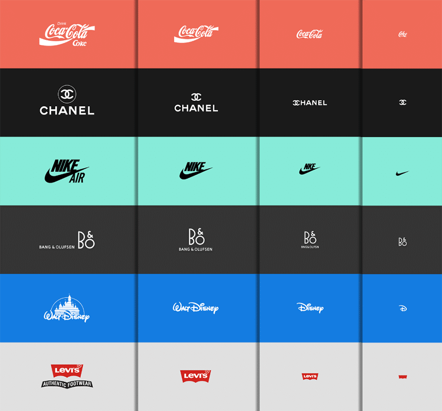
Many brand designers and agencies are now evolving their mindsets on producing fixed logos. Joe Harrison, a British designer, published an interesting project recently. He took existing famous brands and re-designed the logos to adapt to various screens. The iconic logos become increasingly simplified for smaller screens.
Joe quotes on his project saying:
“Responsive logos’ is a project that explores how brands might adapt for todays multiple devices and screen resolutions. By applying responsive design principles to individual elements of a logo, and stripping out detail in relation to screen size, a more legible and appropriate logo can be displayed. The concept aims to move branding away from fixed, rigid guidelines into a more flexible and contextual system.”
– Joe Harrison
So, Harrison’s work shows logos that look different at every level. They use more or fewer elements, and those elements can be organised in various ways to match the screen size. It’s a simple formula which works well and of course, we can still work out all the brands without a doubt.
So, do you need a responsive logo design for your business?
I’m often asked as a brand designer, “What’s the best shape for my logo?”. My simple answer now would be – make sure you have a responsive logo. Your logo should consist of a variety of options to suit all marketing channels. (Previously, a few years back, I would have said rectangular, incase you were wondering.)
Consequently, when I design logos for my clients, I always make sure that alongside the main logo, there are also options for social media and, of course, a favicon. If other logo options are required for large format, I also produce these. An example of this can be seen here:
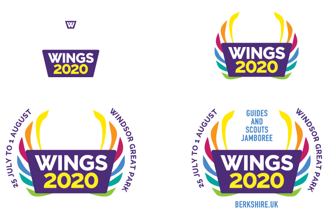
WINGS2020 RESPONSIVE LOGO DESIGN
az.design was commissioned to produce a logo for a Guides and Scouts Jamboree event in Windsor Great Park. The logo was to be used across a variety of marketing materials from online to offline. Large format banners and small pin badges, as well as branded merchandising. Online social media channels and a responsive website. A responsive logo was produced detailing logo options for all the above.
How do you create a responsive logo from your existing logo?
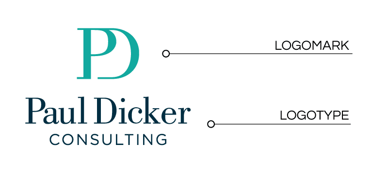
In order to create a responsive logo, you don’t necessarily need a complete brand overhaul with a new logo. You could simply refresh your logo – producing simplified logo options from it. This can be achieved by looking at the elements that make up the logo. Most logos have a logomark and a logotype – shown on the Paul Dicker Consulting logo below. These can often be split to simplify the logo. The mark can then be used on it’s own as the screen size becomes smaller.
Check out Paul Dicker Consulting’s website to see how the full boxed logo is used on the homepage. Then the logomark is used on the sticky header, mobile navigation header and favicon. View the Paul Dicker Consulting case study in our portfolio, to see the full project spec.
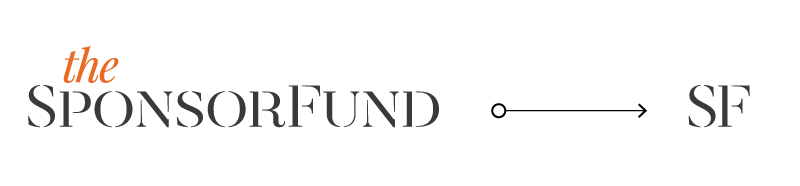
However, not all logos have a logomark and a logotype – so cannot follow this simple method. For example, if your logo is just typographic – consisting only of type. Then you need to look at an identifying letter or shape within the logotype, that could be used as the screen size decreases. This can been seen in the example below with The SponsorFund logo. The SF can be taken and turned into a simple mark which could be used as a favicon or on a mobile navigation header.
Do you need help creating a responsive logo?
If you feel it’s time to be on-trend with a responsive logo design, but are unsure how to do it, contact az.design. I’m always available to discuss your requirements and provide a quote. As mentioned in the article above, it could just be a simple brand refresh that’s required, using your current logo rather than starting from scratch. View my blog post on rebrand or refresh, for a better understanding of the difference between the two.
Remember, almost 60% of all website users are now viewing on a mobile device. So it’s really important to make sure your brand works and is recognisable on small screens.