Ok we’re halfway through January 2020, but I thought I’d write a quick blogpost on the stand out brands of 2019. A mixture of brands that touched me personally in 2019 and also brands that seem to stand out to many as being successful.
1. A brand that makes the impossible, possible.
I discovered the first brand when on holiday in Los Angeles in April. We were visiting a vegan friend and he took us to have an Impossible burger. What’s that I hear you Brits say? Its the most amazing plant based burger that’s really truly delicious and feels and tastes like meat!
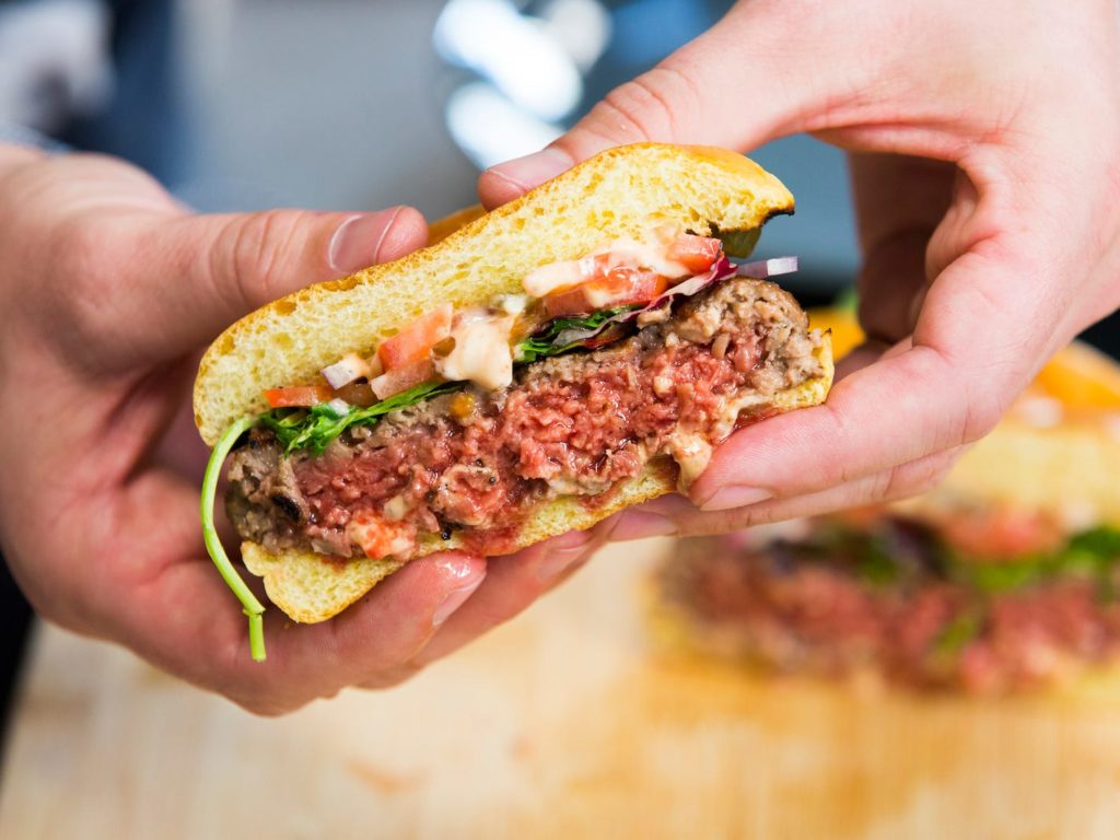
When I came home, I explored their brand and website further and found a simple logo mark working alongside a bright colour palette and fun, quirky illustrations for the visual language. Not only a great brand concept but also stunningly simple visuals.
The brand is so current and on trend – with it’s focus on ethical produce which won’t harm our planet. In a recent article for Design Week, Emma Barratt, creative director at Wolff Olins, was asked about her favourite branding design project for 2019 and her response was:
Impossible burgers. It’s flipped the meat industry on its head, tapped into a mainstream audience, and is positive for planet and society. I can’t recall its logo, but I know what it does, and what it’s called. A brand that makes impossible, possible.
2. The master of all cards
So, Mastercard has taken the brave step toward being nameless – removing the logotype and using just the icon on it’s cards and marketing. Well actually, it’s not that brave as everyone recognises those iconic overlapping red and yellow circles as being Mastercard. In doing this, they join the mega brands like Nike, Apple, Target & Johnson.
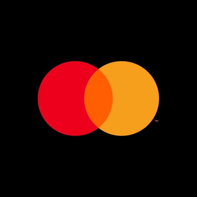
I think this is a great move and a simplification that sits brilliantly alongside the new fresh banking alternatives that hit the market in 2019 such as Monzo and Starling. Starling cards are super simplified and clean with just a logo on the front and all the card details on the back. Super slick! It’s a perfect example of a brand remaining current and keeping up with the newbies on the block.
A warning though, that this is only really going to work once your brand has gained significant recognition and been around at least a few decades. So don’t start thinking, ‘let’s drop our logotype and be known by a symbol’. I can think of one famous artist/brand who did that and it didn’t work!!
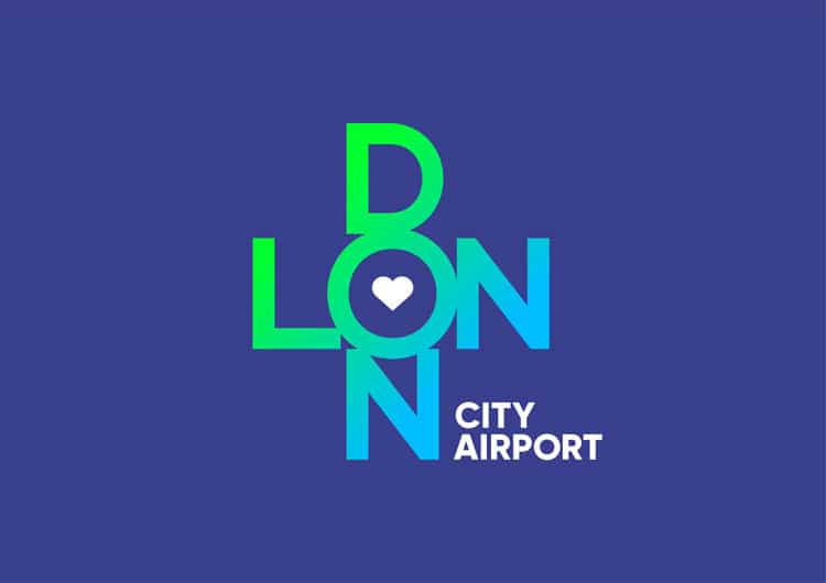
3. City Airport meets a changing target market
London City Airport rebranded to meet its changing demographic. The ratio of those travelling for leisure exceeded those travelling for business for the first time in the previous year, so a new brand was need to reflect this. The “vibrant” new identity came from one of my favourite London studios, The Allotment.
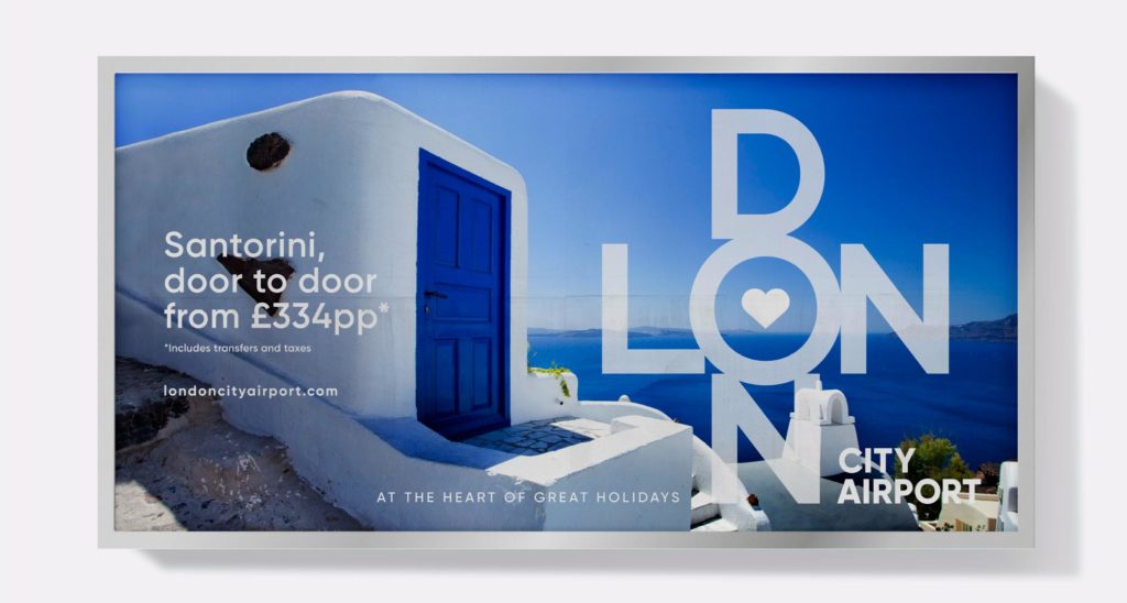
The new logo spells out the word London, centred around an ‘O’ with a heart at its centre. The visual language and animations created really make the brand exciting and engaging – standing out well on wall graphics, vans and adverts. It really promotes London as a destination as well as the airport. This could possibly be my favourite brand of the year with it’s broad variety and scope of use across different mediums.
4. More than just a telecoms business
I have a connection to BT as my grandfather was General Manager back in the day when it was the only telecoms company in the UK. I remember going to the BT tower as a child for his retirement party and meeting Buzby the BT bird. Anyone remember him? I wonder what my grandfather would think of the new BT rebrand?
BT Group rebranded in 2019 to celebrate 50 years in business and to highlight the diverse range of technology offered. The identity was rolled out across BT, including its four sub-brands; BT TV, BT Sport, BT Redcare and BT Wholesale.
The logo has has mixed reviews with some loving it’s new simplicity while others hate it and can’t understand how it tool three and a half years to complete! It does however fit in alignment with new sustainability goals for the company — it has a target of using 100% renewable electricity globally by 2020.
A recent article in Design Week explained how …
Design Week readers were fans of the “simple” and “clear” identity and especially its versatile logo that could “support a range of creative possibilities”.
I concur with the DW readers – I also love the simplicity of the new logo. I’m not so sure about the colour purple though. It’s certainly memorable and not many competitors use purple so it stands out from the crowd. But from a colour psychology perspective, it doesn’t shout innovation and sustainability. It does say courage and honour however. Read more on the colour purple in my blogpost here.
5. Cancer support charity gets a fresh perspective
Over the past few years, I have lost both dear friends and family to the big C. Macmillan helped support my friend’s loved ones, so are a charity very close to my heart.
Macmillan Cancer Support was given a rebrand by studio Dragon Rouge in collaboration with the charity’s in-house design team in an effort to diversify its volunteer base and convey the more “positive” side of its work. Founded in 1911, the charity provides support for people with cancer — of which there are currently 2.5m in the UK.
Macmillan felt it was a bit dated and that volunteers were mainly middle class, white women having coffee mornings. As part of the new visual language, dynamic template posters and leaflets were produced so that volunteers could shout about their fundraising events. Simple, graphic green mugs are chinking with the message “here’s to you, and you”. I even attended an event that one of my clients set up last year and added a blog post for them with their templates.
So the best brands adapt to the changing world and customer. They think about what the consumer wants and they answer it, not just in how it looks, but in how they behave, what they do and how they say it. Brand for the future are about experiences and substance, not just about pretty imagery.
Get in touch with me, if your brand needs to evolve in 2020!