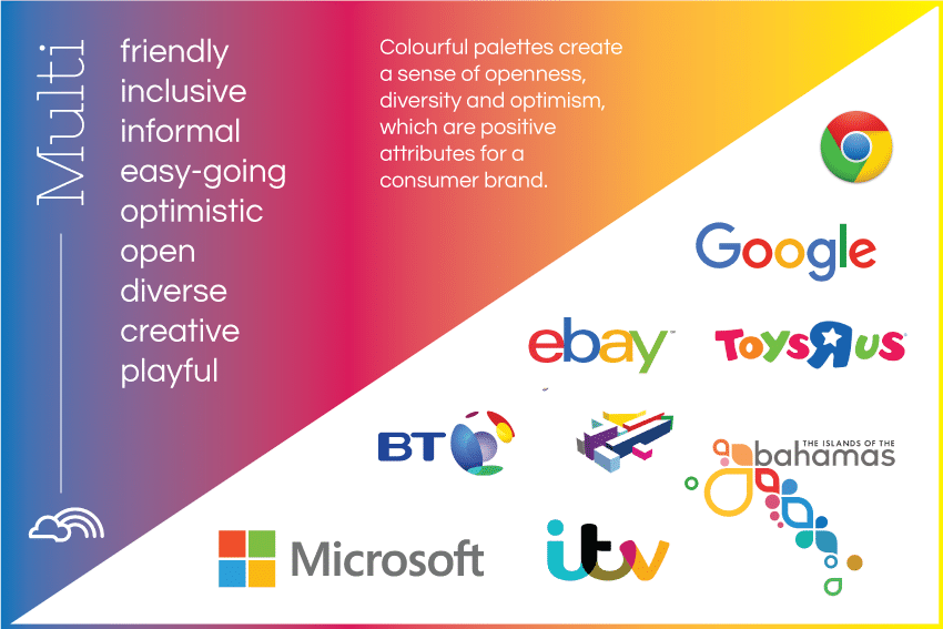
Is a multi-coloured logo right for your brand and will it attract your target customer? Some of the world’s largest brands are colourful. Microsoft, Google, Ebay – what do they all have in common? They are internet or IT brands. Colourful logos are a relatively new phenomenon – partly due to the rise of the internet and economical 4-colour digital printing.
Using multiple colours allows brands to avoid cultural, personal or psychological taboos that may arise from focusing on one specific colour. As we have seen in my previous posts on colour – every colour has specific meanings and associations connected to them. By choosing a multi-coloured logo, a brand can disassociate itself from these specific meanings and be more open and inclusive. Colourful logos are more likely to stand out against other single or two colour logos. They are different, fresh and modern.
Colourful palettes tend to communicate a sense of playfulness, openness, informality and creativity. They are often used for children’s products as they have a child-like, playful feel which is fun and easy-going. Charities also use multi-colour logos to show an inclusive togetherness and a sense of unity. Many TV and media channels use multi-coloured logos to demonstrate their vibrancy and diversity.
Colour is excellent for global brands as using a diverse and bold colour palette helps brands to communicate an open approach to global cultures, race (skin colour), preferences, and ideas.
Positive Colour Meanings:
- cheerful, happy, playful, fun
- optimistic, uplifting, illuminating
- inclusive, unified
- diverse, multi-disciplinary
- fresh, modern
- easy-going, informal
Negative Colour Meanings:
- gaudy
- child-like
- cheap


