DESIGN TIPS by Angela Zeballos
THE AZ.DESIGN FUNDAMENTALS
Now with online tools such as Canva, PicMonkey and Piktochart, it’s very simple to create your own stunning graphics for your digital marketing. Without doing myself out of work, I would like to share with you some key design tips to help you produce striking, visually-balanced graphics.
01. On the GRID in the GUTTER by a MARGIN
A grid is the starting point for most designers when setting up a new design. A well-implemented grid will transform your work from something average to something clean, clear and effective.
Grids come in many shapes and sizes and you can build them to be flexible, adaptable and to suit your design. They help designers align elements in relation to each other on the page, which produces a neater, visually effective design.
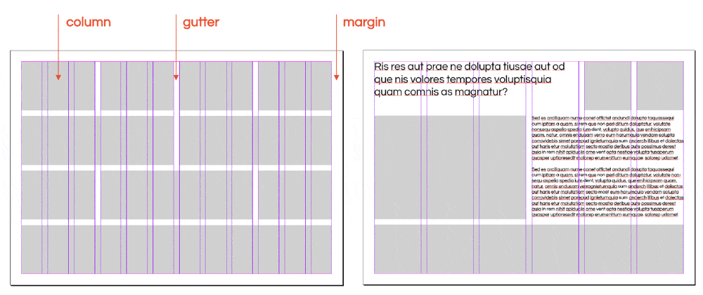
A grid is made up by margins, columns and gutters. The margins are the clean space around the edges of your design – these are usually even all the way round or at minimum on opposite sides. Columns are the number of line/spaces going vertically down the composition. The gutter is the space between the columns. With text you need a large gutter for legibility whereas between images you could just have a very thin gutter or even no gutter at all.
I personally like to work with high number of columns. – For example, 6 or 12 as this can then be divided into 2 or 3 equal columns or 2 unequal columns. See the visual below.
02. White space IS NOT empty space
Perhaps the most important of all my design tips and one I find myself explaining regularly to clients when they ask me to fill in the blank space.
White space is one of those diverse and effective tools that can add something special to your design. Well used white space helps give more focus on a specific aspect of your composition. It lets your design ‘breathe’ and helps balance out your elements and create focus.
In this case and many others, it’s important to recognise that the white space is not empty space. It does not need to be filled with a graphic or a texture or some type, it’s doing its job just like every other element.
Equally when considering photographic imagery, composition and leading lines are essential to help guide the viewer’s perception and journey. Here’s a useful resource on leading lines you might like to read: Leading lines photography.
03. Keep it clean and simple
When it comes to communicative designs I firmly believe that simple is best. Effects like drop shadows, bevelling, textures and gradients all have their time and place, just not always together. The current trend in design is very flat – with no drop shadows and discreet gradients, duotone images or flat colour.
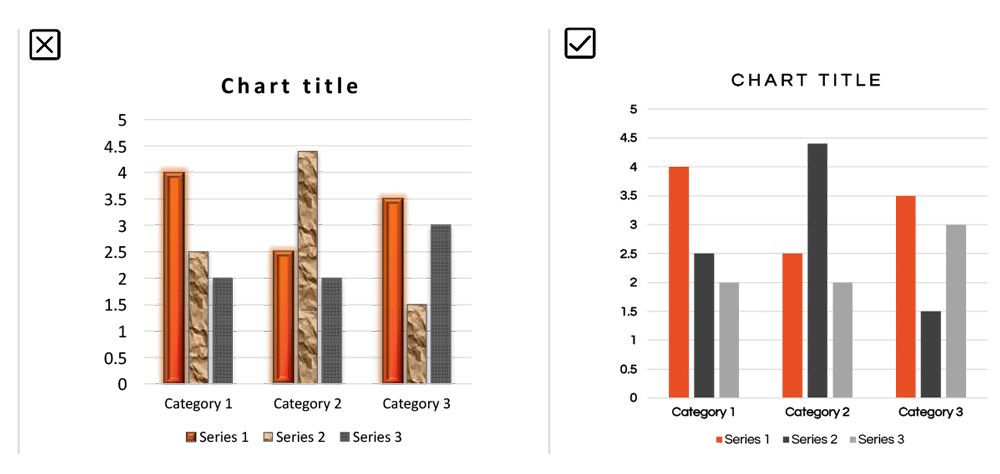
A common situation where a lot of effects are often used is charts and graphs. Have a look at the graphic below that shows a bar graph with a lot loaded into it, a lot of effects, a lot of elements, it’s a lot to take in.
The graph to the right, however, shows how taking effects and some elements away from the design declutters the information and makes for a much easier read and aesthetically pleasing design.
While there are some instances where there are certain labels, values or elements that you can’t take out, taking out as much as you can without compromising the communication can refocus your information. Sometimes, less really is more.
04. Purposeful hierarchy
Within the realm of design, hierarchy concerns the arrangement of visual elements in order to signify importance. So, the more important elements are made to hold the most attention through scale, colour, type etc. The least important elements are made to hold less attention.
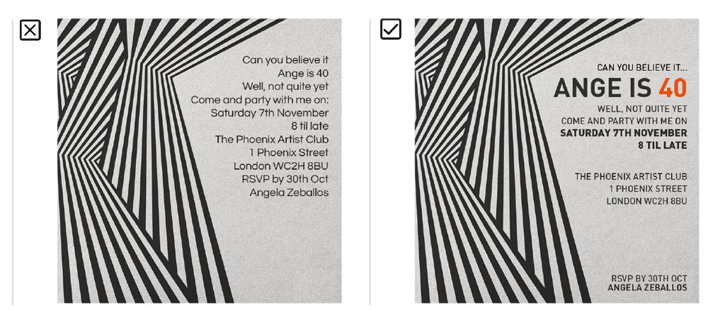
Hierarchy is most commonly used in typography. In the below example, the invitation on the left is laid out with all the type in the same size and weight, making all the information hard to gather in a quick skim. The example to the right, however, has had a little bit of hierarchy introduced to the type.
Even with just the smallest adjustments to the colour, weight and size of certain elements, the information becomes much easier to digest and make sense of.
05. Legibility rules over aesthetics
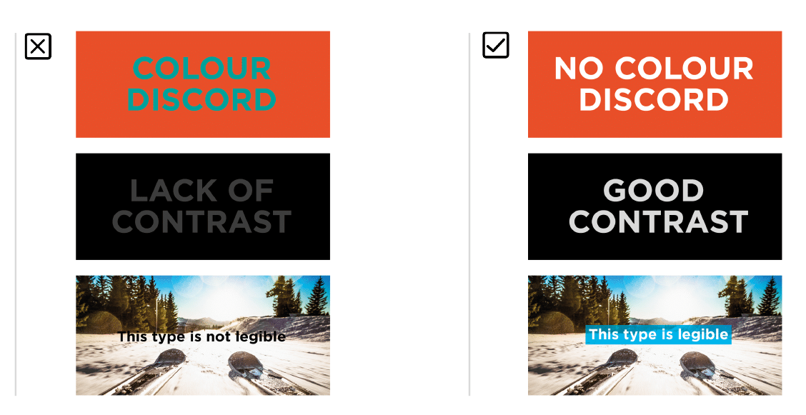
The primary purpose of graphic design is to visually communicate a key message, so it’s obvious that legibility is vital.
So, what hinders legibility? There are a few things that can affect how much effort is required to interpret a design. A common example is a lack of contrast between the text and background – keep contrast high to prevent this issue.
Another example would be using a colour clashing palette. Green text on red background for example, is really hard to read and impossible if you are colour blind!
Another common mistake is type size – the usual problem being that the type is too small. Consider your audience, would they have a difficult time reading the type? If you’re unsure, ask for others’ opinions – while your eyes may read it perfectly, others may not.
Type for onscreen should ideally be no less than 16pt for excellent legibility and printed type should never go smaller than 6pt – and that would literally be the small print on a document.
Well, that’s the first half of my top 10 design tips for you to take in and focus on when you’re next designing a flyer or brochure or even website. Look out for part two where I will discuss colours, typography, text and grammar.
If there’s one thing you should remember from this post, it’s LEAVE WHITE SPACE in your designs. By white space, i mean empty space, if the background is green, then leave green space. 🙂
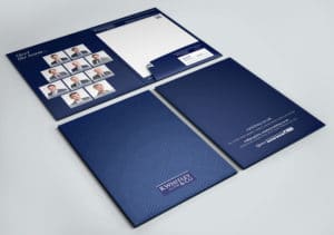
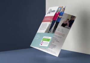
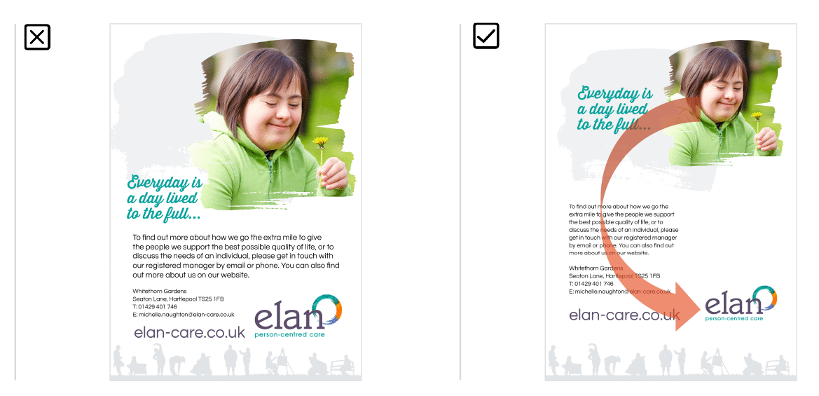
Here are some examples in my portfolio that demonstrate the above design tips: