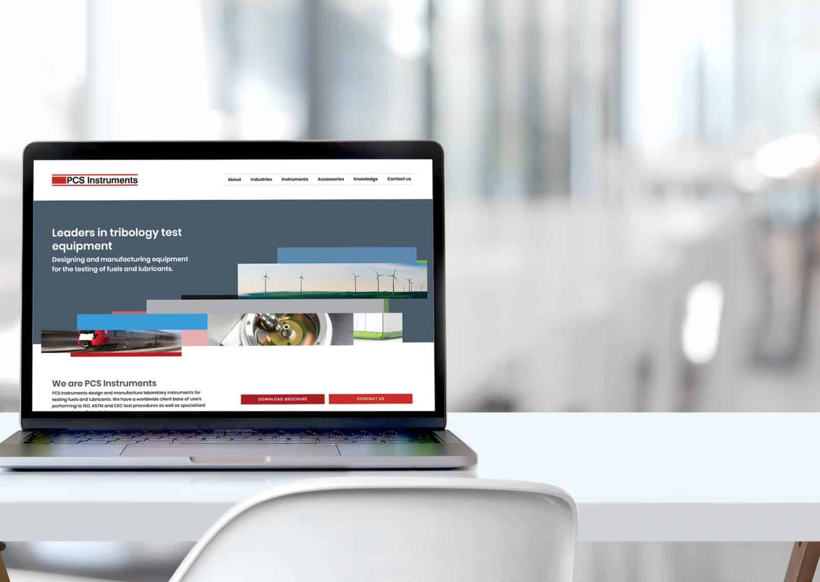
PCS Instruments
Engineering company rebrand & website design
PCS Instruments approached AZ Design to help with their brand consistency. As leaders in Tribology Instrument manufacturing (that’s science lab equipment to you and me!), they wanted to attract commercial and lifestyle markets on top of their established energy and industrial ones.
WORK CARRIED OUT
Visual identity
Brand guidelines
Brochure design
Website design
Exhibition stand design


brief
When they reached out to us, PCS Instruments was all over the place with various design styles for different outputs. Although they were an established business in their sector, the brand was not reflecting this professionalism. It looked tired and dated – especially in comparison with competitors – and they also wanted to break out into the more polished industries of Leisure and Beauty. So a brand refresh was definitely on the cards! Whilst they had capabilities in-house to manage some of the marketing materials, they lacked knowledge to bring it all together into a professional-looking, sleeker brand that appealed to newer markets.
AZ Design started with a Brand Audit Report, which included advice and suggestions to improve brand consistency and establish the best path for the brand refresh. As the project was focused on moving into new markets, we focused our analysis on their digital and printed marketing channels, with competitor insights to inform direction.
Result
PCS Instruments now stand proud against their younger, more contemporary competitors and have the USP of being established whilst looking current. The new brand identity has given them confidence to approach businesses in Beauty & Leisure industries with their new polished image.

Working with Angela has been a pleasure. She took the time initially to fully understand our company ethos and requirements. As a result AZ Design produced an excellent brand guidelines document. With Angela’s continued support we are updating all of our marketing material to be consistent and inline with our new contemporary look.
– GRACE HULLY Sales & Marketing Manager
Other relevant branding projects