Spotlight Communications
Elevating a luxury travel PR agency through design
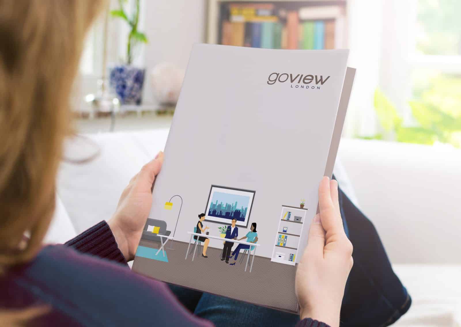
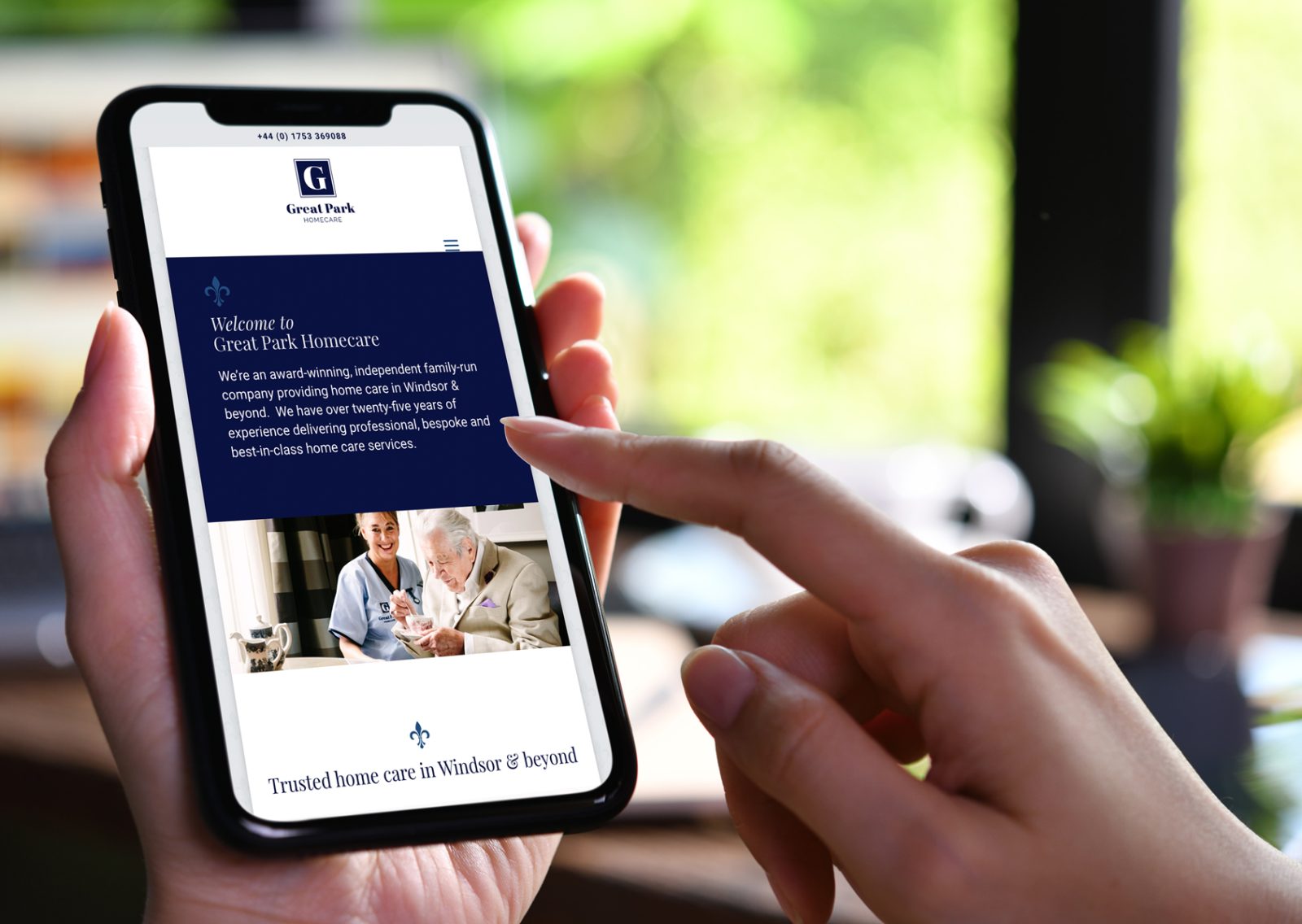
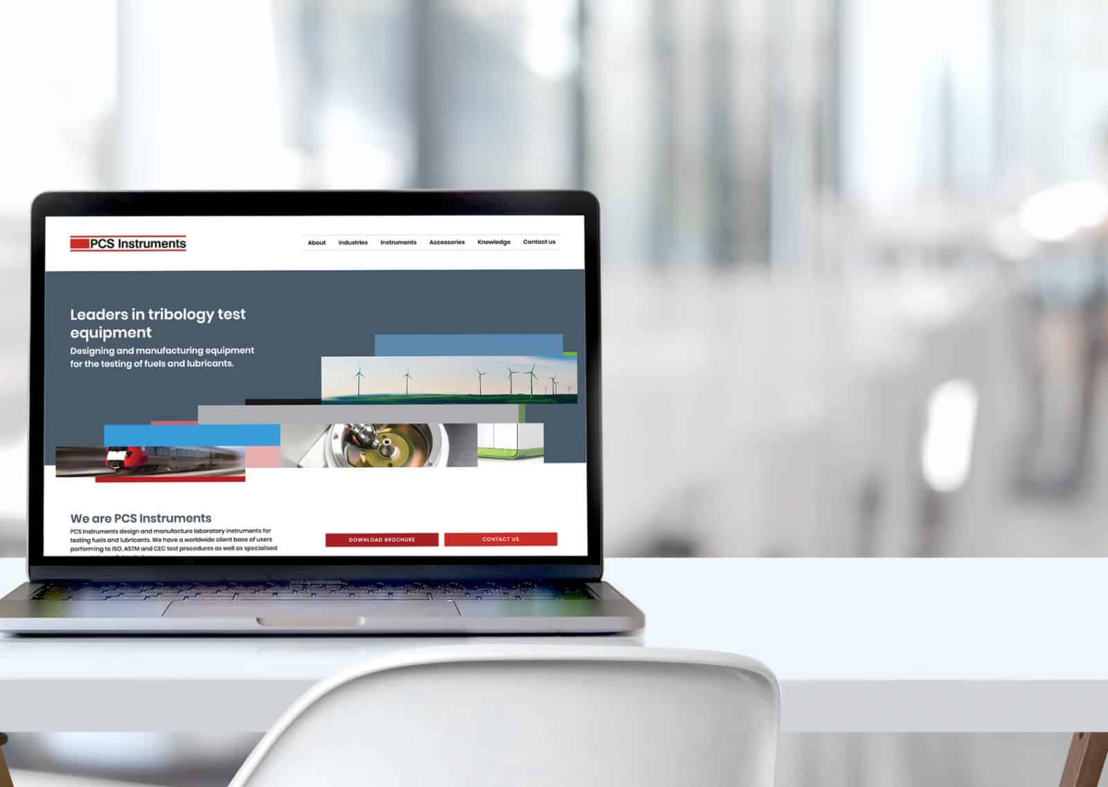
Spotlight Communications, a PR agency in luxury travel, wanted to embark on a rebrand under new leadership. The goal was to shed the original red colour entirely and create a more refined, upscale visual identity to mirror the team’s expertise. They approached AZ Design to create the new brand and re-design the 25+page website, for which we developed a bespoke quote.
Logo design
Visual identity
Brand guidelines
25+page website design+build
Creds document
Pitch deck


Brief
The brand wanted to appeal to businesses in the upscale travel sector whilst actualising the brand’s personality: approachable, efficient, resourceful, flexible, creative, confident, and honest. When it came to the website, it needed to be a pleasure to navigate, visually and practically.
Result
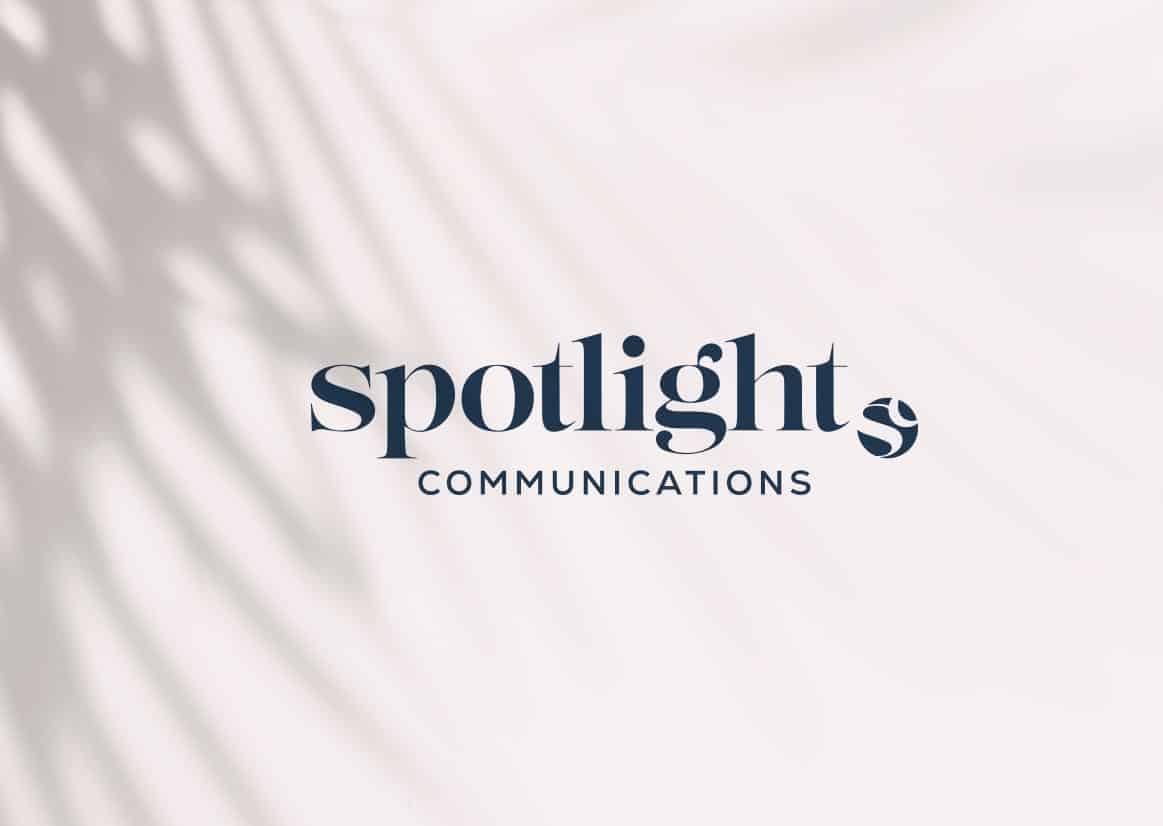
A luxurious magazine aesthetic was the driving force behind the branding. The logotype was updated with a softer serif font and responsive versions for versatility. The circle element from the old logo was emphasised, now featuring a monogram globe mark symbolising the business’s global presence. Dusky pink and navy became the primary brand colours for a muted, sophisticated appeal. To complete the transformation, we completely redesigned the website. The result is polished, and positioned to appeal to Spotlight’s target audience.

Today we launched our fabulous new brand and website and I could not be happier. So happy we worked with Angela and I would highly recommend her personal approach and creative solutions. She has literally re-invented us and absolutely to her credit, made such a huge job look so easy.
– LUCY CLIFTON, CEO at Spotlight Communications
Other relevant branding projects