Wormhole Capital
A new investment company doing things differently
Wormhole Capital backs founders who think independently and have big ambitions. Business partners Vivek and Nick wanted a brand and website to match their purpose and that speaks to the right people. It was important that the branding conveyed Wormhole’s desire to do things differently but also didn’t look out of place in the fintech investment industry.

Brief
Wormhole wanted a brand that was evocative of their purpose. Bold and audacious, unafraid and innovative. Straight-talking and uncomplicated.
Result
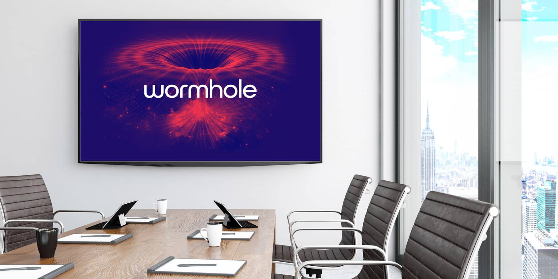
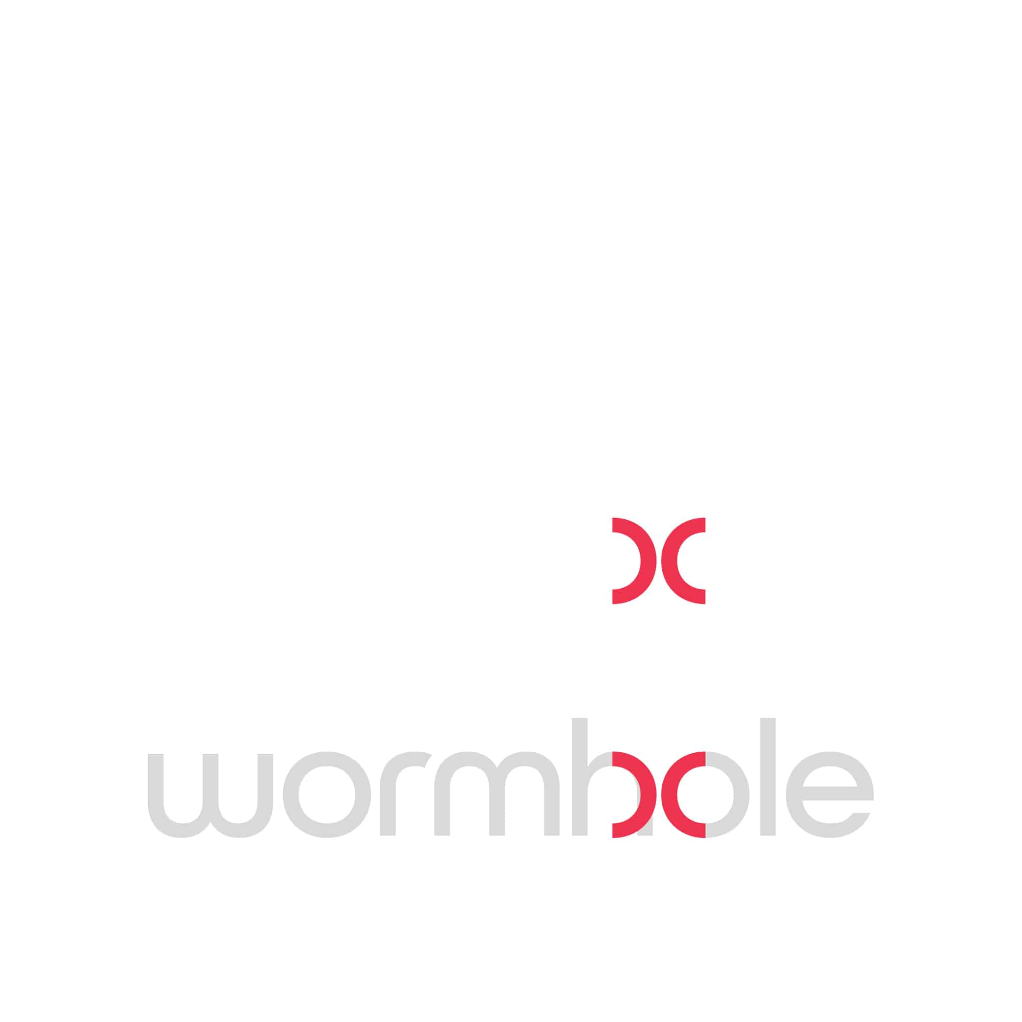
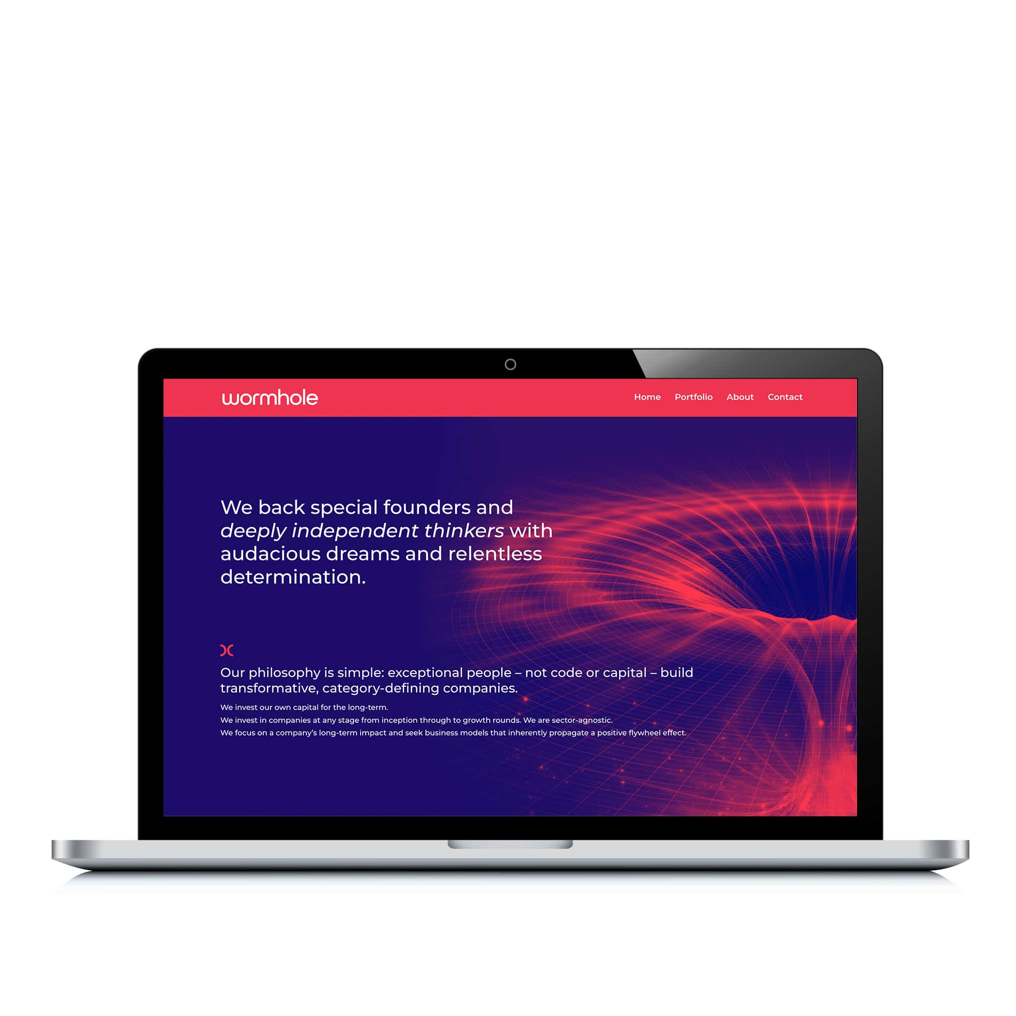
A simple, modern logotype was produced along with a wormhole mark taken from the logotype. In addition, a bold image of a wormhole was graphically altered to work with the duotone colour palette of the brand. The result is sleek branding and a dynamic visual identity that simultaneously stands-out in the market and appeals to the target audience.
With only a vague sense of what we wanted to achieve, Angela took our unstructured sentiments and developed them into a phenomenal brand design and aesthetic that we are absolutely delighted with.
– NICK HYDE, Partner at Wormhole Capital
Other relevant branding projects
